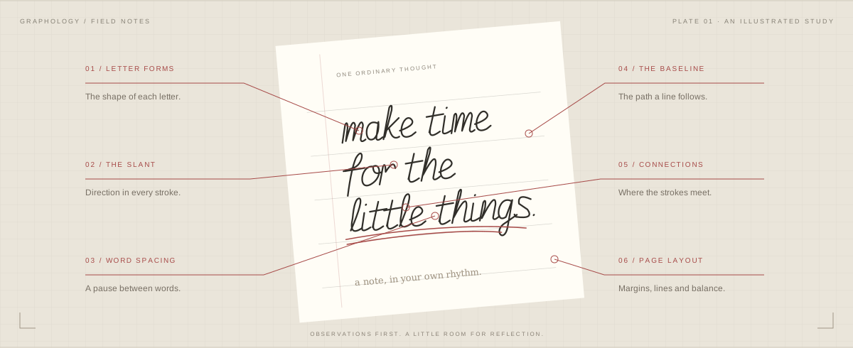
ⓘ Your report connects visible handwriting with speculative personality reflections. For entertainment and self-reflection; handwriting cannot establish your real personality.
02 — A DIFFERENT KIND OF READING
Small details. Fresh perspectives.
Understand what you can see. Get curious about what it brings to mind.
↗
01 / OBSERVE
Graphology starts with letter shapes
Explore letter forms, the direction of your slant, and how your writing sits on the page. A close look at handwritten letter shapes and slant can reveal rounded loops, angular turns and changes in letter height. Compare those details with your photo before considering the personality reflection they inspire.
hello↔you
02 / NOTICE
The space in between
Look at the gaps between words, the flow of each line, and the rhythm of your layout. In a graphology reading, word spacing and line spacing may stay consistent or change as the page fills up. Compare the baseline direction across several lines before drawing a conclusion from one tilted sentence. Open or crowded gaps describe the page; they do not prove how sociable, independent or organized its writer is.
✳a little more curious.
03 / REFLECT
A prompt to pause
Playful graphology interpretations become journaling prompts. Take what resonates and leave the rest. Ask yourself when a suggested tendency fits your experience, and remember an occasion when it does not.
04 / BASELINE
The direction of a line
Notice how words travel across the page: level, rising or falling. Camera angle can change what you see. A tilted photograph or ruled paper can influence the apparent baseline, so keep those conditions in mind. The reading should describe the visible direction without turning it into a judgment about your mood.
05 / CONNECTIONS
Where letters meet
Explore joined and separate strokes, loops and transitions. Different scripts follow different conventions. Your everyday writing may combine print and cursive, or connect some letters while leaving others apart. Those choices are worth noticing, but learned habits and the purpose of the note can explain them without a personality label.
06 / LAYOUT
The page as a whole
Look at margins, line spacing and overall arrangement. A clear, complete photo makes these details easier to observe. Leave some space around the writing when you take the picture. The graphology analyzer can then consider the relationship between the lines and page edges instead of drawing conclusions from a tightly cropped word.
07 / LETTER SPACING
Room for every letter
Look closer at the space inside a word. Tightly grouped letters and open gaps add another layer to its visual rhythm. Distinguish letter spacing from the larger breaks between words. If you want clearer notes, try adjusting one kind of gap at a time and compare the result with your usual writing.
08 / CONSISTENCY
Familiar shapes, small changes
Compare repeated letters within your sample. Notice the shapes that return and the small variations that make handwriting feel human. One unusual mark is less informative than a pattern across several words. Use the report to spot those patterns, then check whether they recur elsewhere on the same page.
09 / CONTEXT
A moment on paper
A quick note and a careful journal entry can look different. Keep the pen, surface and pace in mind as you explore your sample. Comparing two pages is more useful when you know why each was written. A change in appearance does not automatically mean a change in your underlying personality.
A journal, a reminder, a page of notes. Start by looking at the handwriting.
Click either image to enlarge ↗
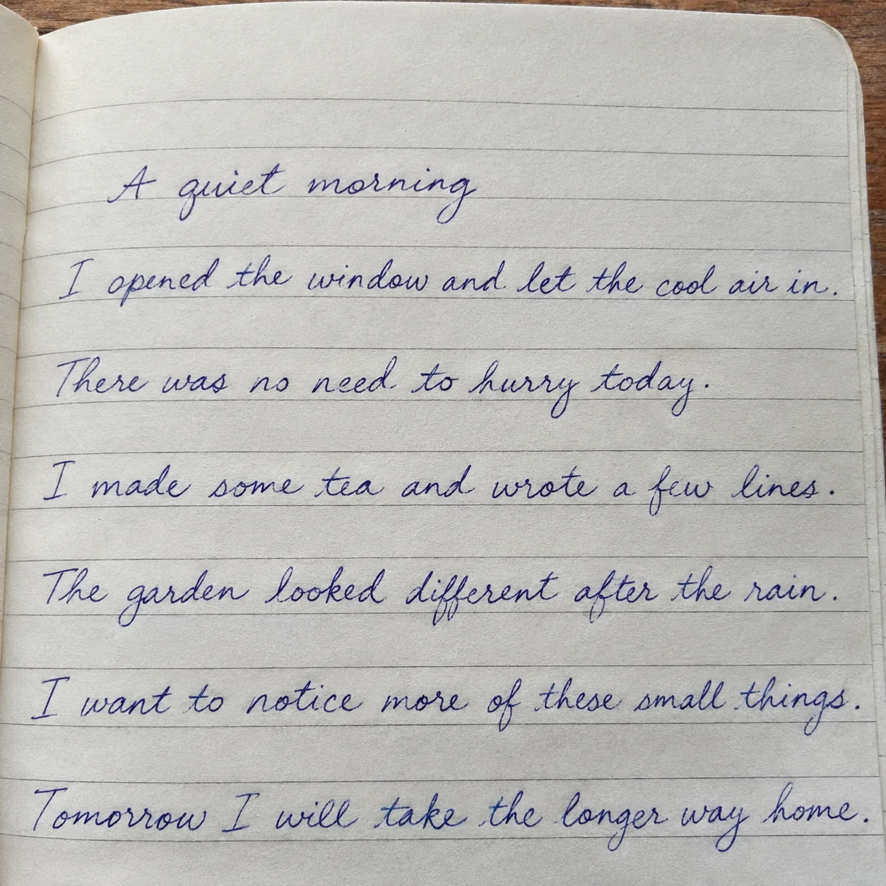
01 / THE JOURNAL
A quiet morning
Click either image to enlarge ↗
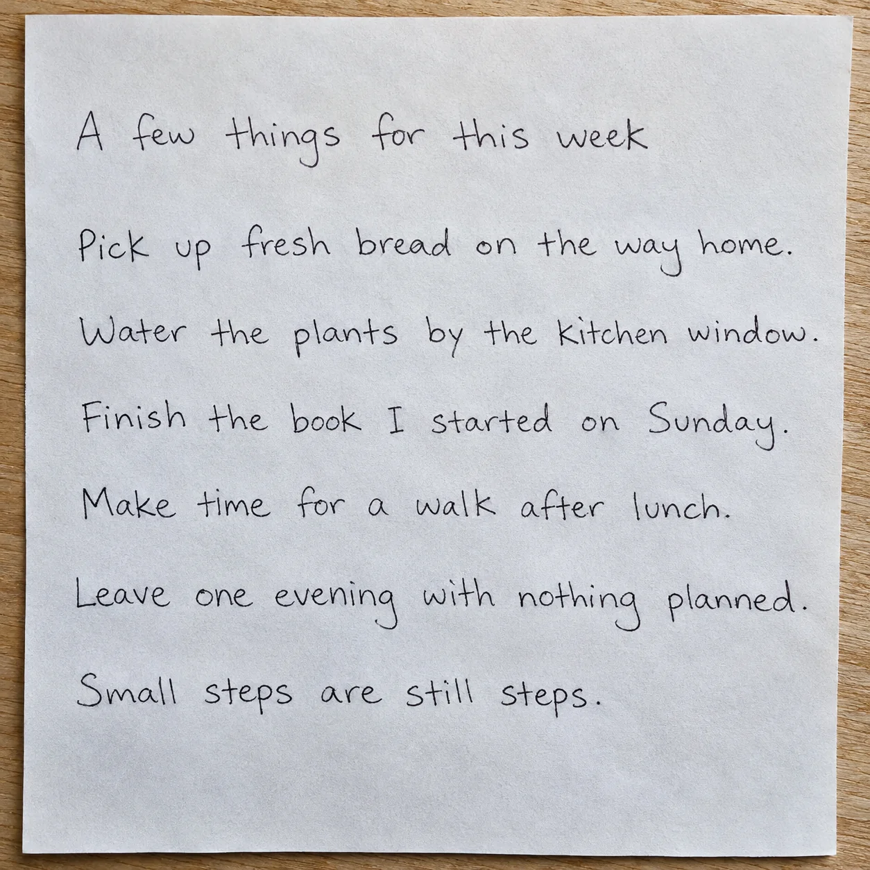
02 / THE EVERYDAY NOTE
A few things for this week
Click either image to enlarge ↗
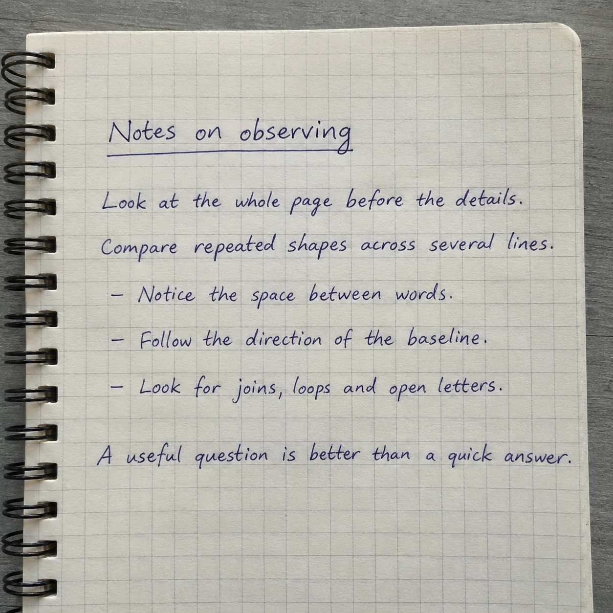
03 / THE STUDY NOTES
Notes on observing
AI-generated handwriting images with detailed sample reports. These are illustrative examples, not customer uploads.
PERSONALITY & EVERYDAY TENDENCIES
Warm expression, measured pace
This flowing, spacious script traditionally evokes a blend of warmth, orderly pacing, and an appreciation for clarity and breathing room.
An AI-generated handwriting image with a detailed sample analysis. No personal upload is used.
Your personality reading
These traditional graphology-inspired interpretations are speculative entertainment for self-reflection, not a reliable assessment of your personality.
01 / Personality Tendencies
Warm and expressive outlook
A steady rightward slant and rounded forms are traditionally associated with openness and a responsive attitude toward the world.
Another explanation: Standard cursive copybooks and right-handed paper angles naturally produce a rightward tilt.
When do you feel most comfortable expressing your enthusiasm to others?
02 / Thinking Habits
Connected and sequential flow
Smoothly joined letters with clear proportions may evoke a preference for linking ideas together in a continuous, logical progression.
Why this reading?
Writing clues: Forms · Connected, rounded cursive / Proportions · Moderate middle zone with clear loops
Another explanation: Joined strokes are a fundamental motor habit of practiced cursive penmanship.
Do you prefer building ideas step-by-step or jumping between disparate concepts?
03 / Approach to Tasks
Measured and structured pacing
Following the baseline closely and skipping lines is playfully linked to valuing order, preparation, and unhurried execution.
Why this reading?
Writing clues: Spacing · Generous vertical and word spacing / Baseline · Steady on ruled lines / Layout · Even left margin and indented header
Another explanation: Skipping lines is a common way to prevent ascenders and descenders from colliding on narrow rules.
How does creating physical or scheduling space affect your focus on a task?
04 / Communication Style
Clear and considerate delivery
Legible, rounded letterforms and distinct word gaps traditionally suggest a desire to be easily understood without overwhelming the listener.
Why this reading?
Writing clues: Spacing · Generous vertical and word spacing / Forms · Connected, rounded cursive
Another explanation: Writing slowly for a clean notebook entry naturally increases legibility and spacing.
What helps you strike a balance between thoroughness and brevity when sharing thoughts?
05 / Social Preferences
Engaged yet boundary-aware
Combining a rightward slant with wide spacing may symbolize enjoying connection while still appreciating personal breathing room.
Why this reading?
Writing clues: Slant · Consistent rightward tilt / Spacing · Generous vertical and word spacing
Another explanation: Page layout and pen grip often dictate spacing and slant regardless of social mood.
How do you recharge after spending quality time with friends or colleagues?
See the handwriting observations behind this reading
This sample features neat, rightward-slanting cursive written on every second line of a ruled notebook, with even word spacing and rounded letterforms.
Slant
Consistent rightward tilt
Many letter stems lean to the right, with relatively little variation across the lines.
Spacing
Generous vertical and word spacing
Words are clearly separated and written on alternating ruled lines.
Baseline
Steady on ruled lines
Words broadly follow the printed rules, with small natural variations.
Forms
Connected, rounded cursive
Most letters within words are smoothly joined with curved, open loops.
Proportions
Moderate middle zone with clear loops
Lowercase bodies are medium-sized while upper and lower loops extend cleanly without tangling.
Layout
Even left margin and indented header
Body lines align smoothly on the left below a slightly indented first line.
A moment to reflect
Consider how the visual breathing room on this page mirrors the way you structure quiet moments or boundaries in your daily routine.
Try writing a few lines without skipping rules to notice how denser spacing feels.
Experiment with an upright slant during note-taking to observe any shift in writing speed.
AI can misread handwriting; compare observations with the original photo. Graphology is not a validated personality test. Do not use this report for writer identification, signature verification, medical diagnosis or employment assessment. A photo cannot reliably measure pen pressure.
PERSONALITY & EVERYDAY TENDENCIES
Clear thinking, personal space
This clear, open script may evoke a calm, grounded, and methodical style that values clarity and personal breathing room.
An AI-generated handwriting image with a detailed sample analysis. No personal upload is used.
Your personality reading
These traditional graphology-inspired interpretations are speculative entertainment for self-reflection, not a reliable assessment of your personality.
01 / Personality Tendencies
Composed and independent
Upright strokes and wide spacing are traditionally associated with a preference for emotional balance and personal autonomy.
Why this reading?
Writing clues: Slant · Upright and vertical / Spacing · Wide word and line gaps
Another explanation: Writing a short note slowly on a square sheet often encourages upright, widely spaced printing.
In what situations do you most value having extra breathing room before responding?
02 / Thinking Habits
Step-by-step clarity
Unjoined, distinct print letters may evoke a habit of breaking down ideas into clear, discrete components.
Another explanation: Using a smooth fine-tip pen naturally produces clean, open loops and legible shapes.
When sharing ideas, how do you balance simplicity with detail?
05 / Social Preferences
Warm yet Mindful of Boundaries
Generous word gaps paired with open letter shapes may reflect enjoying pleasant interactions while maintaining clear personal space.
Why this reading?
Writing clues: Spacing · Wide word and line gaps / Letterforms · Rounded, unjoined print
Another explanation: Writing brief standalone lines on a wide page naturally leaves extra room between words.
What helps you balance social connection with quiet time for yourself?
See the handwriting observations behind this reading
This sample features upright, unjoined print script with generous spacing between words and lines, maintaining a steady horizontal alignment on unlined paper.
Slant
Upright and vertical
Letters stand mostly straight at a near ninety-degree angle with minimal leaning.
Spacing
Wide word and line gaps
Generous blank space separates individual words as well as the horizontal rows of text.
Baseline
Steady and level
The lines remain broadly horizontal on unlined paper, with small natural variations.
Letterforms
Rounded, unjoined print
Characters are formed with clean, open bowls and distinct, separated strokes.
Proportions
Balanced middle zone
Lowercase bodies are medium-sized and well-proportioned relative to the modest ascenders and descenders.
Layout
Consistent left margin
Body lines begin at similar distances from the left edge, with blank space around the text.
A moment to reflect
Take a moment to consider how the visual openness and structure of your page mirror the way you arrange your time and energy.
Try writing a paragraph in fast, connected cursive to notice how a continuous flow feels compared to separate print.
Experiment with narrower line spacing on blank paper to see how denser text affects your sense of visual order.
AI can misread handwriting; compare observations with the original photo. Graphology is not a validated personality test. Do not use this report for writer identification, signature verification, medical diagnosis or employment assessment. A photo cannot reliably measure pen pressure.
PERSONALITY & EVERYDAY TENDENCIES
Structured thinking, flexible rhythm
In traditional handwriting lore, this clean, well-spaced script evokes a balanced, methodical mindset that values clarity, personal space, and adaptable routines.
An AI-generated handwriting image with a detailed sample analysis. No personal upload is used.
Your personality reading
These traditional graphology-inspired interpretations are speculative entertainment for self-reflection, not a reliable assessment of your personality.
01 / Personality Tendencies
Composed and measured presence
Upright, balanced letters are traditionally associated with a calm temperament that blends warmth with self-containment.
Why this reading?
Writing clues: Slant & Tilt · Vertical to Slight Right Slant / Proportions & Zones · Balanced Letter Proportions
Another explanation: Writing slowly for a clean note often produces more upright and uniform letter shapes.
When do you feel most comfortable balancing spontaneity with composure?
02 / Thinking Habits
Adaptable, structured reasoning
Combining separate print with occasional cursive links may evoke a blend of step-by-step analysis and intuitive leaps.
Another explanation: The printed grid paper directly guides both horizontal alignment and consistent indentation.
What kind of structure helps you stay focused without feeling restricted?
04 / Communication Style
Clear and considerate expression
Open, rounded forms with wide word gaps traditionally suggest a preference for being easily understood without rushing.
Why this reading?
Writing clues: Spacing & Rhythm · Generous Word Spacing / Proportions & Zones · Balanced Letter Proportions
Another explanation: Using a smooth rollerball or gel pen on textured paper encourages broader, clearer letterforms.
How do you ensure your ideas come across clearly in everyday conversations?
05 / Social Preferences
Warmth with clear boundaries
Generous spacing and wide margins may symbolize someone who enjoys connection while valuing personal breathing room.
Why this reading?
Writing clues: Spacing & Rhythm · Generous Word Spacing / Page Layout · Structured Margins and Indents
Another explanation: Leaving plenty of whitespace is a common layout choice when making reference notes on a small notepad.
How do you balance social time with quiet space to recharge?
See the handwriting observations behind this reading
This sample features a neat, semi-connected print-cursive hybrid with balanced spacing, level alignment along the grid, and open, rounded letterforms.
Slant & Tilt
Vertical to Slight Right Slant
Letters stand mostly upright with a gentle, consistent tilt to the right.
Spacing & Rhythm
Generous Word Spacing
Words and lines are separated by wide, even gaps across the page.
Baseline & Alignment
Steady Grid Alignment
The writing broadly follows the horizontal grid lines, with small natural variations.
Letterforms & Connections
Print-Cursive Hybrid
Most letters are separate, with occasional smooth joins between neighboring characters.
Proportions & Zones
Balanced Letter Proportions
The middle bodies of letters are rounded and clear, with moderate ascenders and descenders.
Page Layout
Structured Margins and Indents
Margins, an underlined heading and dashed list indents create a clear visual hierarchy.
A moment to reflect
Looking at the open space and steady rhythm on this page, consider where in your week you might create a little more breathing room for yourself.
Try writing a page on unlined paper to see whether your steady spacing and alignment come from habit or the grid.
Experiment with fully connecting your letters for a few sentences to notice how it changes your writing rhythm.
AI can misread handwriting; compare observations with the original photo. Graphology is not a validated personality test. Do not use this report for writer identification, signature verification, medical diagnosis or employment assessment. A photo cannot reliably measure pen pressure.
Write three to five natural lines using your ordinary handwriting. A short reminder or neutral passage works well; no perfect penmanship or personal story is required. Choose writing you own or have permission to process, and leave out identifying details before photographing the page.
02
Bring your words into focus.
Sign in with Google and upload a clear photo. Keep the camera square to the page, use even light and check that small strokes remain readable. Confirm permission to process the image, then submit once and wait for the analysis rather than repeatedly uploading the same sample.
03
Read. Reflect. Keep a copy.
Read the overall impression, explore the personality themes and expand the handwriting details when you want more context. Check the graphology analyzer observations against your original sample. Download the finished report as a PNG image to keep privately or share with a clear explanation that the interpretation is speculative.
A FEW GOOD QUESTIONS
Graphology, explained.
Know what you’re exploring.
What is a graphology analyzer?+
An AI graphology handwriting analysis report starts with features you can check in your photo: letter shapes, slant, spacing and page layout. The graphology reading of your handwriting then connects those observations to five speculative personality themes. You can download the full handwriting report as a PNG image and compare each suggestion with the original page. This is a tool for self-reflection, not a validated personality assessment or a word-for-word transcription.
Is there a free graphology test online?+
Yes. To explore graphology online, upload a handwriting photo and take a free graphology test online. The graphology test offers five themes for self-reflection. Treat this graphology personality test as a starting point for reflection. Sign in with Google for one free full report per day, subject to the site-wide limit.
Can handwriting reveal my personality?+
Graphology has not been reliably validated as a personality assessment. Use this graphology analyzer for entertainment or journaling, and compare any suggestion with real examples from your life. You can disagree with a reading or keep only a useful question. Neither neat nor messy handwriting establishes intelligence, honesty or a diagnosis. Do not use the report to evaluate candidates, identify writers, verify signatures or make important decisions about someone else.
How does AI analyze my handwriting?+
AI observes your handwriting and uses traditional graphology associations to offer speculative personality reflections. These are for entertainment and self-reflection, not a reliable personality assessment.
What should I upload?+
A clear JPG, PNG or WebP photo under 8 MB and at most 4 megapixels. Write 3–5 natural lines on plain paper. Avoid names, addresses and sensitive details. HEIC, PDF, SVG and animated files are not supported.
What happens to my photo?+
Your photo and report are private and are not shown in a public gallery. You can delete both whenever you choose. Your photo is processed by an AI analysis service, whose data handling policies also apply.
Can I save my report?+
Yes. Save your graphology analyzer report as a PNG image once it is ready. The full report includes five themes and the handwriting clues behind them. Before sharing, check that you are comfortable with everything shown and explain that the personality interpretation is speculative. You can also delete the uploaded sample and saved report from the app. Deleting a completed report does not restore today’s allowance.